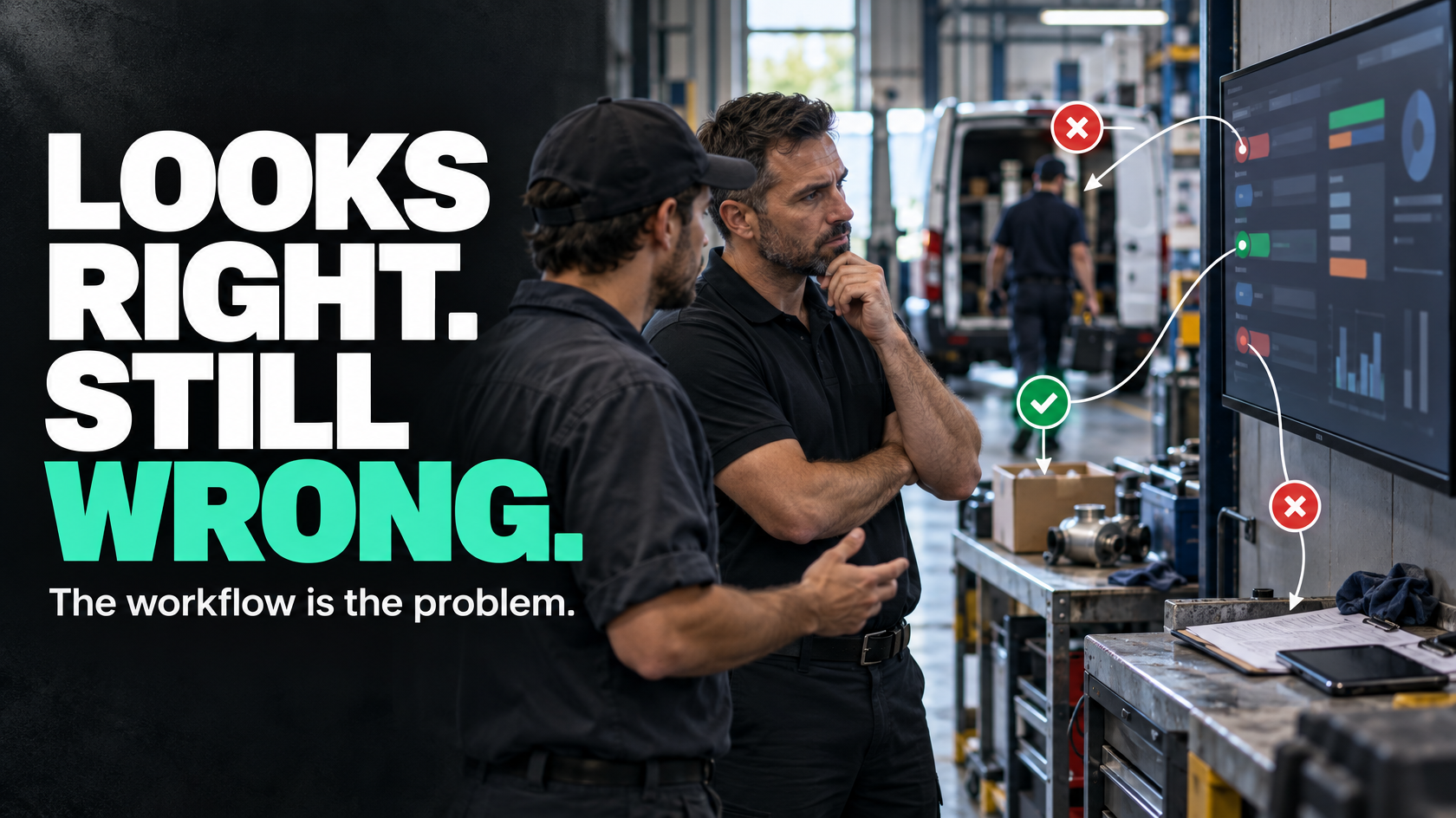
When the dashboard looks fine but still doesn’t help
A lot of businesses reach the same frustrating point: the dashboard exists, the charts are updating, there is plenty of data in the system, but nobody really trusts it or uses it to run the operation.
On paper, that sounds like a reporting problem.
In practice, it usually isn’t.
Most dashboard failures happen because the workflow underneath is inconsistent. The dashboard is only showing what the systems are being given. If staff use statuses differently, if key events are recorded late, if ownership is unclear, or if nobody has agreed on what a metric actually means, the dashboard may still look polished while being operationally weak.
That is why having data is not the same as having management visibility.
A dashboard displays information. Management visibility helps someone decide what needs attention, who owns it, and what should happen next.
If the dashboard cannot do that, the issue is normally upstream.
A dashboard is only as reliable as the workflow behind it
Dashboards tend to get blamed for problems they did not create.
If a job board says 18 jobs are “in progress”, that sounds useful. But what does “in progress” actually mean?
- Work has been scheduled?
- A technician is on site?
- Materials have been ordered?
- The first stage is complete?
- The office is waiting on photos?
- The customer is waiting for a return visit?
If different people use the same status to mean different things, the dashboard cannot produce reliable visibility. It is faithfully reporting inconsistent operational behaviour.
The same problem shows up in almost every reporting environment:
- leads marked as qualified based on personal judgement rather than a defined rule
- quotes logged as sent before they are actually sent
- jobs marked complete before all required documents are in
- timesheets entered days late
- approvals handled over phone or email but never reflected in the system
- chargeable variations discussed on site but not captured anywhere structured
In each case, the data exists in some form. But it does not exist in a way that supports trustworthy reporting.
A dashboard cannot fix a workflow that depends on memory, interpretation and side conversations.
Why “available data” often still produces poor visibility
When people say, “the data is there”, they usually mean one of two things:
- The information exists somewhere in the business.
- The software technically stores fields related to the metric.
Neither guarantees useful reporting.
For a dashboard to be genuinely useful, the data needs to be:
- defined consistently
- captured at the right point in the process
- updated close enough to real time to support action
- tied to clear ownership
- structured in a way that reflects operational reality
That is a much higher standard than simply being present in a database or spread across a few platforms.
For example, a service business may want to see overdue jobs. The information required sounds simple enough. But the moment you look closer, questions appear:
- What counts as overdue?
- Overdue against booked date, due date or SLA?
- Does a job waiting on customer approval count?
- What about jobs paused due to weather or parts availability?
- Who owns the next action for each state?
- When is the job considered active again?
If those rules have not been defined operationally, the dashboard cannot solve the ambiguity. It can only present a number that people will argue about.
Bad status design quietly ruins reporting
Status design is one of the most common reasons dashboards disappoint.
Many businesses use statuses as rough labels rather than operational states. That works until they want reporting.
A useful status should do more than describe the job vaguely. It should indicate something real about the state of the work, ownership, or next action.
Poor statuses are usually too broad, too subjective or too overloaded.
Examples include:
- In Progress
- Pending
- Waiting
- Complete
- On Hold
These may feel convenient, but they collapse too many different conditions into one label. Once that happens, the dashboard cannot distinguish between jobs that are healthy, jobs that are blocked, and jobs that are simply unowned.
A stronger status model might separate things like:
- Scheduled
- On Site
- Awaiting Site Photos
- Awaiting Customer Approval
- Awaiting Materials
- Ready for Invoice
- Awaiting Payroll Review
- Closed
That does not mean creating endless statuses. It means designing statuses that reflect actual operational handovers and decisions.
If status changes are meaningful, reporting becomes meaningful. If status changes are vague, reporting becomes decorative.
Stale data destroys trust faster than no dashboard
A wrong number is bad. An out-of-date number is often worse.
Once managers learn that the dashboard is behind reality, they stop relying on it. After that, staff go back to calling people, checking spreadsheets, sending messages and manually reconstructing what is happening.
At that point, the dashboard may still exist, but operationally it is dead.
Stale data usually comes from one of three issues:
Updates happen too late
The event occurs now, but the system update happens later. A technician finishes a job on site, but completion details are entered that evening or the next day. A quote is approved, but the handover to operations waits until someone gets back to the office.
The dashboard may technically be accurate eventually, but not when decisions need to be made.
The workflow allows work outside the system
If important actions happen through phone calls, inboxes, notebooks or ad hoc messages without structured updates, the dashboard lags by design. It is waiting for someone to remember to translate real-world activity into system activity.
Nobody owns update quality
If no one is clearly responsible for changing status, recording required fields or capturing exceptions, data freshness becomes optional. Optional inputs become unreliable inputs.
This is why stale data is not just a reporting problem. It is an operational discipline problem.
Defining metrics matters more than charting them
A chart can make an undefined metric look more legitimate than it is.
Before building or refining a dashboard, it is worth asking basic questions such as:
- What exactly does this metric mean?
- What business event creates or updates it?
- Which system is the source of truth?
- Who is responsible for the input?
- How quickly should it update?
- What decision should this metric support?
If those questions are not settled, you do not really have a metric yet. You have a label.
Take something common like “jobs completed this week”. That sounds straightforward, but it can mean very different things:
- site work finished
- paperwork finished
- internal QA completed
- customer sign-off received
- job ready for invoice
- job fully closed in the system
If different teams mean different versions of completion, the dashboard will generate confusion rather than visibility.
The same applies to profitability, response times, quote turnaround, technician utilisation and backlog reporting. Unless the business defines the metric consistently, the chart only gives false precision to a messy process.
Every metric should support a decision or action
Many dashboards fail because they answer interesting questions instead of useful ones.
A management dashboard should help someone decide what to do. If it does not change attention, prioritisation or action, it is probably clutter.
That does not mean every metric needs to trigger a workflow automatically. But each one should earn its place.
Useful questions include:
- Which jobs are stuck and why?
- Which quotes are past follow-up and who owns them?
- Which completed jobs are not ready for invoicing?
- Which technicians have missing timesheets or supporting documents?
- Which approvals are holding up work?
- Which jobs are beyond expected stage duration?
These are decision-oriented questions. They point toward action.
Less useful dashboards often over-index on broad summaries:
- total jobs this month
- total revenue by category
- total completed tasks
- overall board activity
Those summaries may have a place, but they rarely help a manager intervene in the moment. They tell you that activity happened. They do not tell you where the operation needs help now.
Exception-based reporting is often more useful than summary reporting
One of the biggest shifts in dashboard thinking is moving from “show me everything” to “show me what needs attention”.
Managers usually do not need a prettier view of normal operations. They need visibility into exceptions.
That might include:
- jobs with no update in the last 48 hours
- quotes approved but not handed over
- work completed without required photos
- invoices blocked by missing job closure data
- payroll items awaiting review
- tasks sitting in a status longer than expected
- service calls without an assigned owner
Exception-based reporting is often more valuable because it connects information to intervention.
A dashboard that tells you 146 jobs are active is less useful than one that tells you 11 active jobs have no next scheduled action.
The first is a summary. The second is something a manager can work with.
This is where many dashboard projects go wrong. They focus on visual completeness instead of management usefulness.
The real issue is often event capture, not reporting
A lot of operational visibility comes down to whether important events are captured properly when they happen.
Examples of key events might include:
- quote sent
- quote approved
- deposit received
- materials ordered
- job scheduled
- technician arrived on site
- first stage completed
- defects identified
- customer sign-off received
- timesheet submitted
- job ready for invoice
If these events are captured late, inconsistently or outside the system, reporting becomes reconstruction. Staff are trying to rebuild what happened after the fact.
That creates dashboards that are always slightly behind, slightly disputed and rarely trusted.
Good reporting usually comes from good event capture. The dashboard is just the presentation layer.
If you want better visibility, ask where the relevant operational event should be recorded, by whom, in which system, and what that event should trigger next.
More dashboard tooling will not fix broken operational inputs
When a dashboard disappoints, the temptation is often to buy a better reporting tool, connect another data source, or commission a more advanced build.
Sometimes that is justified. Often it is not.
If the underlying inputs are weak, more tooling just makes the problem more expensive.
Common symptoms include:
- multiple reports showing different answers to the same question
- managers exporting data to “clean it up” manually
- teams debating the number instead of using it
- dashboards updated, but decisions still made through side conversations
- increasing report complexity without increasing operational clarity
That usually means the problem is not visualisation. It is one or more of the following:
- unclear source of truth
- inconsistent status usage
- missing event capture
- delayed updates
- no ownership for key fields
- metrics defined differently by different teams
Until those issues are addressed, another dashboard layer rarely creates real visibility.
What to fix upstream before touching the dashboard
If your reporting tools exist but still are not helping, the most practical move is to look upstream.
1. Define what each key metric actually means
Pick the metrics that matter operationally and write down the definition clearly.
For each one, decide:
- what counts
- what does not count
- when the metric changes
- which system owns it
- who relies on it
If people cannot explain the metric the same way, the dashboard is not ready.
2. Review status design
Check whether your statuses reflect real operational states, handovers and blockers.
If one status covers five different scenarios, reporting will stay vague. The goal is not more statuses for their own sake. The goal is meaningful system state.
3. Map the event that should trigger the update
Do not just ask whether the field exists. Ask what real-world event should change it.
For example, if a job should move to “Ready for Invoice”, what exactly has to happen first? Site work done? Photos uploaded? Customer sign-off? Internal check complete?
Define the event, then define who records it.
4. Make ownership explicit
If everyone can update a field, often no one reliably does.
Key data points need clear ownership. That does not always mean one person forever. It may mean ownership shifts by stage. But it should be visible.
5. Focus on timeliness, not just completeness
Data entered eventually may still be operationally useless.
If the dashboard supports same-day decisions, then updates need to happen during the process, not at the end of the week.
6. Build for exceptions
Do not only report on totals. Decide what “attention required” looks like and surface that clearly.
That is often where the real management value sits.
What good looks like operationally
A good dashboard is not just visually clean. It reflects a clean enough operating model underneath.
In practice, that usually means:
- core metrics are defined consistently
- statuses represent real workflow states
- important events are captured when they occur
- updates happen soon enough to support action
- ownership is clear at each stage
- exceptions are visible before they become problems
- managers know what to do with what they are seeing
When that is in place, people stop arguing with the dashboard and start using it.
That is the difference between reporting that looks informative and reporting that actually helps run the business.
The dashboard is usually the mirror, not the cause
If your dashboard still fails even though the data seems to be there, the problem is rarely the chart itself.
It is usually a sign that the workflow, definitions or update rules behind the chart are not stable enough yet. The dashboard is exposing a systems problem, not solving one.
That is why the fix often starts with process mapping, status design, ownership and event capture before anyone adds more reporting layers.
If your operation spans multiple teams or systems, and the numbers still do not lead to confident decisions, it is often worth stepping back and mapping what should be captured, when, by whom and for what decision. That is usually where useful visibility starts, and it is the kind of operational reporting problem 5M Consulting helps businesses untangle.